From 3D pies to heatmaps: the new Orders report
More than twenty releases of e-shop.report have shipped this year, and I would like to start showing regularly what happens under the hood. This is part one of the Building e-shop.report series — and we start with the oldest page in the whole app: the Orders report.
The starting point: ~2010 called, it wants its report back
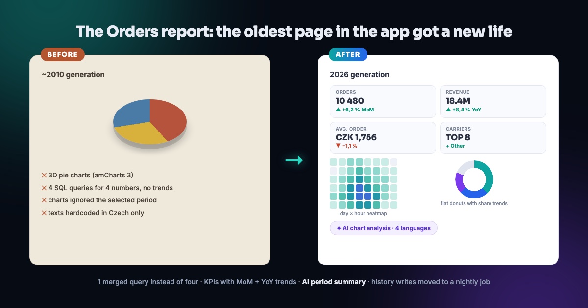
The Orders report was the last page of the oldest generation. Charts in amCharts 3, 3D pie charts (yes, the tilted ones), four separate SQL queries for four numbers with no trends whatsoever, texts hardcoded in Czech — and two charts even ignored the selected period and drew the entire history of the e-shop no matter what you picked in the date picker. Bonus: every page view wrote the e-shop's performance history three times.
What changed
- KPI tiles with trends — orders, revenue and average order compared to last month and last year (MoM + YoY). One merged query instead of four.
- Day × hour heatmap — instead of a 3D pie of days, you see at a glance when customers actually buy.
- Flat donuts for carriers and payments — with share trends in percentage points against the previous window.
- Winners & losers table — which products grow and fall, with the impact in money and a click-through to detail.
- AI on every chart — an AI analysis button plus a new AI summary of the whole period; page texts in 95 sentences × 4 languages.
- Performance writes moved to a nightly job — history writes moved from page views to a scheduled SQL job. The page is faster and the database can breathe.
A section-by-section tour of the new report
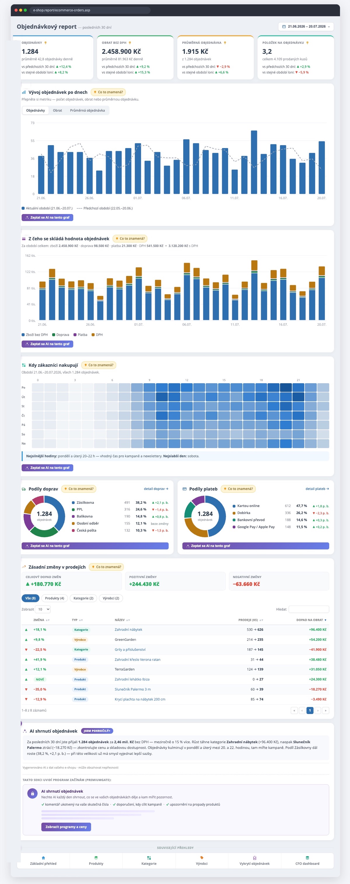
The product ships in four languages; the approved design below shows the Czech version.
KPI tiles with trends
The four numbers you want first: orders, revenue excluding VAT, average order and items per order. Every tile shows a daily average and two comparisons — against the previous 30 days and the same period last year. The arrow tells you the trend before you finish reading the number. And instead of dead "Explanation" links, every section has a live "What does this mean?" hint.
Orders over time
One chart, three metrics — orders, revenue, average order — switchable with one click. A dashed line shows the previous period, so the comparison is always in front of you. And crucially: the chart finally respects the period selected in the date picker.
What an order's value is made of
A stacked chart splits every day into goods, shipping, payment and VAT. You see at a glance how much of your revenue is actual product and how much is the "wrapping" around it.
When customers buy
A day × hour heatmap instead of a 3D pie. Darker cell = more orders — and the report writes the conclusion for you: "Strongest hours: Monday and Tuesday 8–10 pm — a good time for campaigns and newsletters." That is what a report you don't have to decipher looks like.
Carrier and payment shares
Flat donuts with the TOP 8 carriers and payment methods plus an "Other" row. Each item shows count, share and the trend in percentage points against the previous window — you see not just the state but the movement. Click through to the detailed views.
Major changes in sales
Which products, categories and brands grow or decline — with the impact in money, not just percentages. A summary on top: total impact of changes, positive and negative separately. The table filters by type and clicks through to product or category detail.
AI order summary
A human-readable paragraph: what happened in the period, who drives it, who is losing and what to do about it — generated by AI from your data and anchored in real numbers. Plus an "Ask AI about this chart" button under every chart.
Related dashboards
A footer with follow-up dashboards — straight from insight to action, no menu hunting.
Production always surprises
The mockup passed approval and an independent review, we deployed — and the first production screenshot showed a carrier legend with hundreds of rows. Why? Some e-shops include the specific pickup point in the carrier name: "Zásilkovna – Praha 4", "Zásilkovna – Brno"… and every branch pretended to be its own carrier.
The fix: normalize names to the carrier, aggregate, and show TOP 8 + an "Other" row — in the chart, in the legend and in the data passed to AI (a language model should not get hundreds of rows as input either). A lesson as old as BI itself: people approve your mockup, but only real data tests it.
How we build with AI at our side
The whole rewrite was a human + AI (Claude) tandem. The process that works for us: first a mockup, which I approve before a single line of code exists. Then implementation, followed by an independent review by another AI agent — this time it caught one critical finding that would have hurt in production. Two automated code audits run before every deploy. AI writes, the human decides — and the result is a rewrite that would previously have taken me weeks.
What to take away
Modernizing an old report is not about prettier charts. It is about every number having context (a trend), every chart answering a question, and the page not straining the system. And if you are curious what we build next — a new part of this series lands every week.
You will find the Orders report in e-shop.report — and if you have your own experience modernizing old reports, message me on LinkedIn.